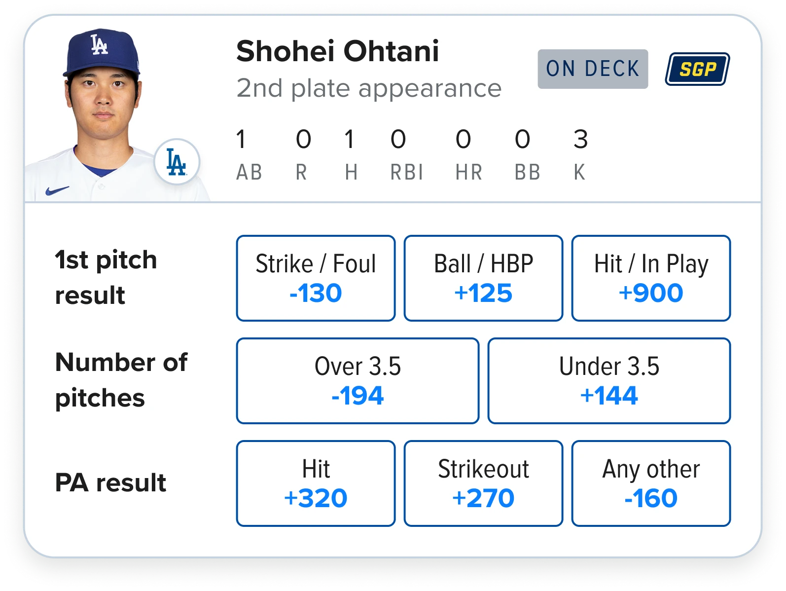
Quick bets were identified as a real area of opportunity from our engagement data. However, 87% of customers had reported encountering a bet error. By consolidating markets and adding stats to support users in making informed decisions quicker, bet success and parlay creation both skyrocketed.
Role
Lead Designer
Parlay Conversion
+49%
Bet Conversion
+29%
Engagement
+17%
Project Context
Live betting lets customers place bets while a game is already happening. Unlike pre-match betting, users are reacting in seconds to game state, momentum, odds movement and game changing moments.
Definition
“A market that is guaranteed, or reasonably expected to play to a conclusion within a period of that event”
So think
- Will there be over or under 3.5 pitches for the next batter?
- Will a football player make a successful catch in the next drive?
The core problem
Finding, assessing and actioning bets before the market suspended.
The generic page template didn’t support users in placing bets quickly enough leading to a frustrating experience riddled with bet errors.
The opportunity space
Initial work and findings that were used to construct the “why?” for prioritizing this work
Customer data
87%
of surveyed customers experienced a bet failure.
22%
of all errors live betting were from Quick Bets.
11%
of bettors were high value, +4.5pp higher than other live bets.
Insights
Major growth area
Customer behavior was rapidly shifting toward in-play betting experiences.
Monetization potential
Quick-duration betting moments created opportunities for higher engagement and live parlay activity.
Strong engagement
Customers who regularly engaged with Quick Bets showed stronger repeat betting behavior.
Success metrics
Bets per user
Users placing 3+ Quick Bets become “sticky” users.
Parlay conversion
Most Quick Bets were placed as singles, revealing an opportunity to convert into higher-value parlays.
Overall bet conversion
Users were attempting to bet but often couldn’t complete the flow in time.
Success metrics
Bets per user
Users placing 3+ Quick Bets become “sticky” users.
Parlay conversion
Most Quick Bets were placed as singles, revealing an opportunity to convert into higher-value parlays.
Overall bet conversion
Users were attempting to bet but often couldn’t complete the flow in time.
Project Kick off
Establishing the current baseline and design constraints before starting exploratory work
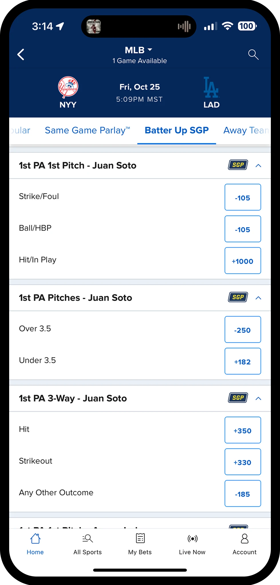
UX Assessment
- Repetitive content, harming readability.
- Markets are all closed by default, requiring multiple taps to show (not shown on screenshot).
- Users needed to leave the experience to view useful player performance stats.
- Suspensions from the pace of these markets made completing bets difficult.
- Betslip flows were not optimized and required several more interactions.
Scope
- 10 weeks to Design, test, iterate and build before the code freeze.
- We knew there was huge efficiency gains to improve the betting flow through the betslip. However, those components are large and complex so fell outside of scope.
Competitive analysis
None of the major competitors had improvements to their quick bet experiences, highlighting the competitive advantage we could have.
Target users
Quick Bets were mostly used by high-value bettors, but most people only used them lightly. Only about 1 in 6 users who saw Quick Bets actually used them, showing that while there was strong interest, the experience wasn’t easy or clear enough for most people to fully engage with.
User Testing - Round 1
5 participants: 2 power Quick Bet users, 3 casual users and unfortunately, lots of no shows! The small sample meant the findings were directional rather than representative.
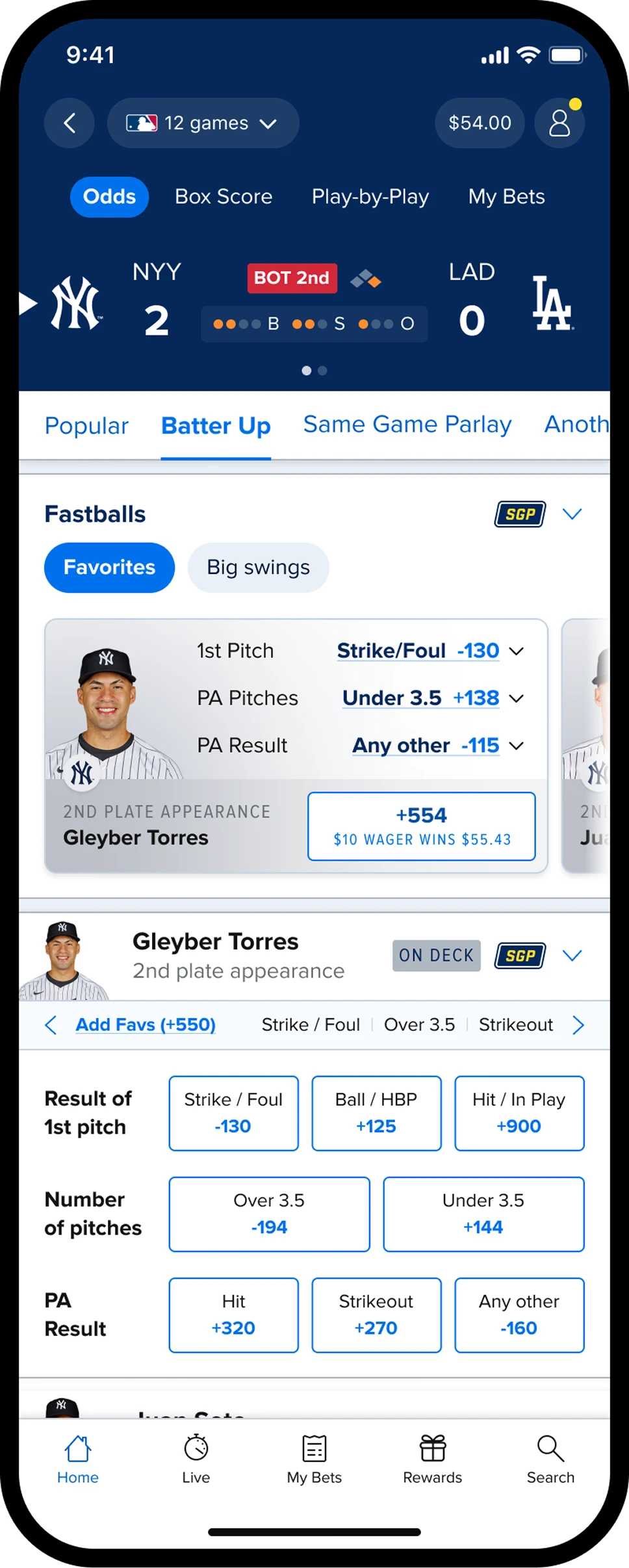
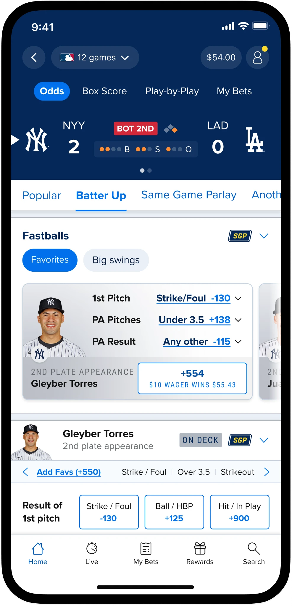
1“Fastballs”Designed to give users a quick way of constructing parlays in a single tap in an effort to improve bet success and parlay creation
- Sentiment
- Didn’t land
- Hypothesis
- By pre-packaging bets, users will need fewer interactions to place more complex bets resulting in a higher chance of bet success.
- Learnings
- Users did not trust bets provided to them. The sports-themed naming added personality, but wasn’t immediately obvious. "Favorites" created the wrong expectation: some interpreted it as popular bets rather than the selection with the lowest odds in the market.
2Player StatusImportant contextual information to aid decision making
- Sentiment
- Positive
- Hypothesis
- By providing more contextual information to users they will be able to make more informed wagers more efficiently.
- The learning
- On-deck and plate-appearance cues helped people judge a bet at a glance. How effective it is would have to wait for launch data.
3Quick bet & StatsA single tap to add the selection from each market with the best chance of winning. Scroll to access useful stats.
- Sentiment
- Some value, once found
- Hypothesis
- By combining pre-packaged bets and stats into a small footprint users will have to scroll less and have access to useful content, increasing bets successfully placed.
- The learning
- Users wanted to create their own wagers rather than blindly adding the lowest priced selections. The arrows to toggle through stats was too subtle and rarely found. Once shown, the stats were appreciated.
4Grouped marketsA consolidated layout reducing scrolling and bringing related betting opportunities closer together
- Sentiment
- Very Positive
- Hypothesis
- By showing selections upfront and placing markets together users will be able to find, assess and place wagers more efficiently.
- The learning
- The grouped market template made finding bets, reading prices, and combining selections easy. It was the strongest structural signal from round one.
User Testing - Round 1
five participants: two power Quick Bet users and three casual users. The small sample meant the findings were directional rather than representative.
Designed to give users a quick way of constructing parlays in a single tap in an effort to improve bet success and parlay creation
- Sentiment
- Didn’t land
- Hypothesis
- By pre-packaging bets, users will need fewer interactions to place more complex bets resulting in a higher chance of bet success.
- Learnings
- Users did not trust bets provided to them. The sports-themed naming added personality, but wasn’t immediately obvious. "Favorites" created the wrong expectation: some interpreted it as popular bets rather than the selection with the lowest odds in the market.
Important contextual information to aid decision making
- Sentiment
- Positive
- Hypothesis
- By providing more contextual information to users they will be able to make more informed wagers more efficiently.
- The learning
- On-deck and plate-appearance cues helped people judge a bet at a glance. How effective it is would have to wait for launch data.
A single tap to add the selection from each market with the best chance of winning. Scroll to access useful stats.
- Sentiment
- Some value, once found
- Hypothesis
- By combining pre-packaged bets and stats into a small footprint users will have to scroll less and have access to useful content, increasing bets successfully placed.
- The learning
- Users wanted to create their own wagers rather than blindly adding the lowest priced selections. The arrows to toggle through stats was too subtle and rarely found. Once shown, the stats were appreciated.
A consolidated layout reducing scrolling and bringing related betting opportunities closer together
- Sentiment
- Very Positive
- Hypothesis
- By showing selections upfront and placing markets together users will be able to find, assess and place wagers more efficiently.
- The learning
- The grouped market template made finding bets, reading prices, and combining selections easy. It was the strongest structural signal from round one.
Research take-aways
Space Efficient
The concept was appreciated for how it consolidated so much information into a smaller footprint.
Users wanted control
Pre-compiled wagers felt like a betting company providing bets they knew would lose. Users wanted to feel like their selections were based on their insight.
Stats helped decision making
Users valued stats highly but wanted better visibility and access to them.
Iteration
Armed with new information, it was time to take a step back, reassess previous decisions and assumptions and reset with more clarity. Working with key stakeholders in Product, Engineering and Trading we were able to agree the next steps before iterating on the design.
Scope adjustments
Additional Markets
Trading teams moved up their timelines for delivering additional markets so “Plate Appearance” markets would be available before the season starts, triggering IA work to accommodate.
Remove parlay builders
Users didn’t trust them. We needed to find other ways to help users construct multi-leg bets.
Make stats prominent
Once discovered stats were seen as an essential addition to this experience so explorations to make them more prominent was prioritized.
Engineering updates
Complexity
However it was highlighted that even if the parlay builders had been desirable to users they would have been too complex initially.
Back-end integrations
Work would start to enable MLB stats to be displayed into our frontend components.
Exploration underway
Now we had established a level of confidence with our direction the engineering teams would start to roughly assess the complexity of the changes being proposed.
User Testing - Round 2
24 participants: 5 power Quick Bet users, 19 users who had placed live bets, not necessarily quick bets. The broader MLB live bettors helped us validate usability and adoption beyond core users.
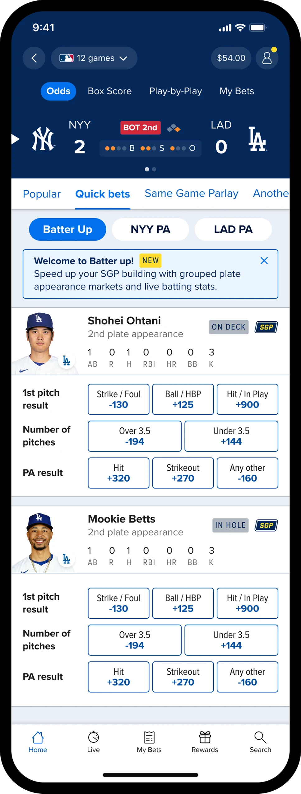
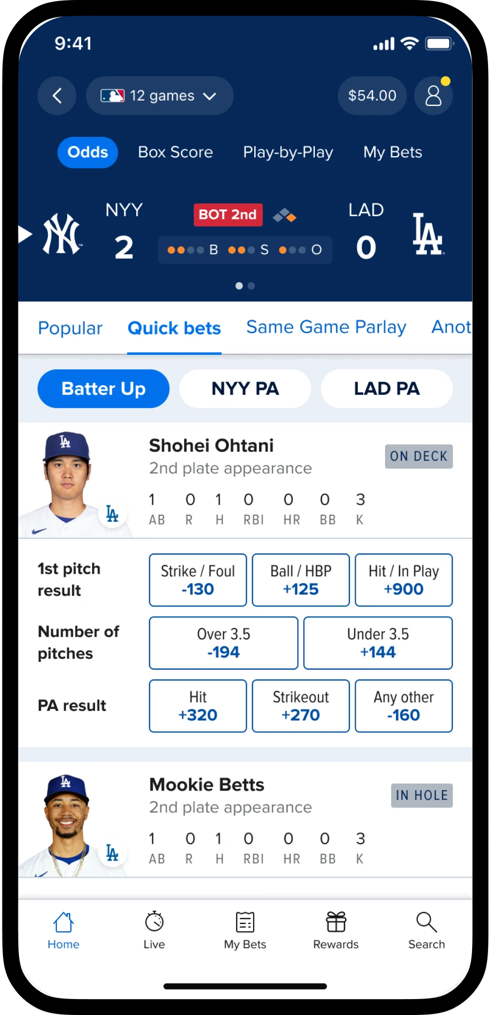
1Page naming and IAClearer naming on the top level along with additional markets
- Sentiment
- Positive
- Hypothesis
- Using more generic terminology on the highest level will make the contents of the page obvious resulting in an increase in engagement. The branded “Batter Up” will then be highlighted by default on arrival.
- Learnings
- Renaming the tab "Quick bets" tested better as people understood what it was for. We were still able to retain “Batter Up” as the branded name for marketing purposes.
2Introduction bannerExplains the tab and nudges parlay building
- Sentiment
- Inconclusive
- Hypothesis
- By explaining the benefits of the page and mentioning “SGP” this will increase the number of parlays placed.
- The learning
- As with most informational text, it wasn’t always read. It was decided to build and test with data.
3Redesigned HeaderShowing key stats upfront without any interactions
- Sentiment
- Very Positive
- Hypothesis
- By showing stats upfront, users will be able to make more informed decisions quicker with more confidence.
- The learning
- The biggest step up: bigger headshots, more information, and no taps needed to see it. Stats access was the round-one weak point, and this fixed it.
4Improved market grouping UIA consolidated layout reducing scrolling and bringing related betting opportunities closer together
- Sentiment
- Very Positive
- Hypothesis
- By showing selections upfront and placing markets together users will be able to find, assess and place wagers more efficiently.
- The learning
- Cleaner selection tiles and pricing made the grid easier to scan, reinforcing that the tab was built for faster bet building.
User Testing - Round 2
24 participants: 5 power Quick Bet users, 19 users who had placed live bets, not necessarily quick bets. The broader MLB live bettors helped us validate usability and adoption beyond core users.
Clearer naming on the top level along with additional markets
- Sentiment
- Positive
- Hypothesis
- Using more generic terminology on the highest level will make the contents of the page obvious resulting in an increase in engagement. The branded “Batter Up” will then be highlighted by default on arrival.
- Learnings
- Renaming the tab "Quick bets" tested better as people understood what it was for. We were still able to retain “Batter Up” as the branded name for marketing purposes.
Explains the tab and nudges parlay building
- Sentiment
- Inconclusive
- Hypothesis
- By explaining the benefits of the page and mentioning “SGP” this will increase the number of parlays placed.
- The learning
- As with most informational text, it wasn’t always read. It was decided to build and test with data.
Showing key stats upfront without any interactions
- Sentiment
- Very Positive
- Hypothesis
- By showing stats upfront, users will be able to make more informed decisions quicker with more confidence.
- The learning
- The biggest step up: bigger headshots, more information, and no taps needed to see it. Stats access was the round-one weak point, and this fixed it.
A consolidated layout reducing scrolling and bringing related betting opportunities closer together
- Sentiment
- Very Positive
- Hypothesis
- By showing selections upfront and placing markets together users will be able to find, assess and place wagers more efficiently.
- The learning
- Cleaner selection tiles and pricing made the grid easier to scan, reinforcing that the tab was built for faster bet building.
Research take-aways
Everything within reach
Users were thrilled about the prospect of having so much information available to them without having to scroll around or change apps to access stats.
Welcome banner was missed
As with most information areas, users didn’t notice the area at first.
Improved terminology
The “Quick bets” verbiage used on the tab was far more obvious to users making it more likely they would interact with the tab in future.
In Summary
By consolidating fragmented markets into a single, player-centric interface, the work made it significantly faster and easier for users to build parlay bets.
Parlay conversion
+49%
Engagement
+17%
Bet conversion
+29%